Configure public-facing styles
You can customise the style of ASSURE's public-facing screens by changing the font, as well as the colours of various elements such as buttons, links, messages, and so on. You can also change the public-facing logo (which also appears on the Login and Forgotten Password screens).
-
On the System Configuration screen, in the General section, click .
-
The Configure Public Facing Style screen appears.
-
To change the font:
-
Expand the Font section and click Font.
The Select Font dialog opens.
-
Select the font you require and click .
-
-
To change the colour of a particular element:
-
Expand the Colours section, then expand the sub-section that contains the element.
GDS colours that can be changed Colours Sub-section
Colour
Description
Brand colour
Brand Colour
The colour of the bottom border of the header, and also the colour of links.
Text colours
Text Colour
The colour of all primary text in the application.
(Currently, this is all text, because secondary text is not used.)
Secondary Text Colour
The colour of all secondary text.
Hint Text Colour
The colour of hints.
Link colours
Link Hover Colour
The colour of a link when the cursor is hovered over it.
Link Visited Colour
The colour of a link that has been already visited.
Link Active Colour
The colour of a link that is currently active.
Banner Link Active Colour
The colour of a link in the page banner that is currently active.
Banner Link Hover Colour
The colour of a link in the page banner when the cursor is hovered over it.
Banner Link Visited Colour
The colour of a link in the page banner that has been already visited.
Border colours
Border Colour
The colour of borders and horizontal separator lines.
Input Border Colour
The colour of the borders of input fields.
Focus state
Focus Colour
The background colour of the element that currently has focus.
Focus Text Colour
The text colour of the element that currently has focus.
Error state
Error Colour
The colour of error and validation messages; for example, as displayed next to fields with invalid data.
Button
Primary Button Colour
The background colour of primary buttons.
Primary Button Hover Colour
The background colour of a primary button when the cursor is hovered over it.
Secondary Button Colour
The background colour of secondary buttons.
Secondary Button Hover Colour
The background colour of a secondary button when the cursor is hovered over it.
Button Text Colour
The colour of text and icons on a button.
Other colours
Banner Background Colour
The background colour of the page banner.
-
Click the linked colour that you want to change; for example: Brand Colour.
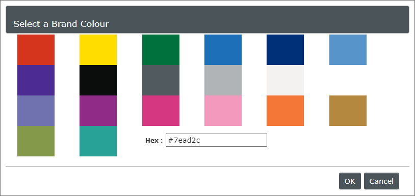
A Select a Colour dialog opens.

-
Click the colour swatch you want, or type a hexadecimal colour code.
-
Click .
-
-
To change the logo:
-
Expand the Logos section, then click .
-
Select the required image file and click .
The logo must be a .gif, .jpg, .jpeg, or .png file, and not more than 1 MB. For best results, it should have an aspect ratio of about 4:1 and a maximum size of 225 x 60 pixels.
-
Click .
You can click
 Remove file to restore the default image.
 -
-
Click .